


.jpg)
Published: November 10, 2016
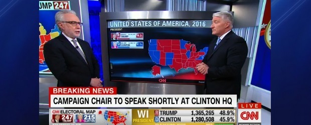
Did you love those interactive maps that reported the recent USA election results? I was aghast at the election results. However, I loved the GIS map interface, the effortless drilldowns and rollups, the comparison of this election to previous ones, the simultaneous display of multiple measures and the rich touch screen navigation.
There were no blue screens of death. Never did a pesky dialogue box appear that pointed to a software bug or a data bust. I saw no sluggish screen refreshes.
In enterprise terms we watched a well-designed interactive visualization application. Don’t you wish you had the same capability for your enterprise? Here’s what it takes.
Visualization software
Software is everything. It’s the glue that makes every application work. The number of vendors in the market for visualization software is enormous. Read the Gartner report: Magic Quadrant for Business Intelligence and Analytics Platforms 2016 for a comprehensive discussion of the pros and cons of the many vendors and their software.
If you have already licensed a major visualization software package, make a serious effort to avoid licensing another one. Loading up on too much software is a high-cost mistake many organizations have made. The problem is not all the software has licensing fees. It’s the significant annual operation and support cost that accompanies every software package you license.
Visualization goal
It’s not about the sizzle on the screen. The visual appeal and interactivity of the visualization application makes it easy to lose sight of the business goal that underlies visualization. This technology is about:
- Making data-driven decisions very frequently as opposed to relying on gut feel.
- Making decisions much faster than market peers as opposed to always waiting for someone who is scrambling to assemble data.
- Executing decisions as intended most of the time as opposed to being derailed by those who are reluctant and hold a veto but shouldn’t.
Help your organization stay focused on the business drivers for the interactive visualization application.
Application portfolio gaps
A surprisingly large number of organizations operate with gaps in their application portfolio. Often these gaps are partially and awkwardly papered over by a myriad of brittle, finicky Excel workbooks.
Data in these Excel workbooks cannot support your visualization goals. Relying on data stored in Excel workbooks is a major risk factor that can torpedo your visualization application project. Plan to fill the gaps in your application portfolio. You will discover various business benefits that will justify this investment.
Excel reporting wizardry
Management is often surprised to discover that the monthly reporting packages they rely on are not simply produced by various applications but are the product of many intense Excel data manipulations performed by various full-time business analysts.
This situation exists because the underlying applications:
- Are oriented to transaction processing, not sophisticated reporting.
- Are being operated at ultra-low cost. The side effect is that data quality is being undermined.
- Were implemented in a rush. Insufficient attention was paid to application integration and reinforcement of superior data management practices.
These issues will conspire to thwart your goal to replace your current monthly reporting process with a much more responsive, interactive, near real-time visualization application. Plan to improve data management practices
Data integration
Visualization applications are most valuable when they display data from multiple applications. This capability rests on the ability to integrate data across the datastores that underlie the individual applications.
Effective data integration can be difficult to achieve because each application uses:
- Unique and incompatible identifiers.
- Different sets of values for reference data.
These issues can make the results displayed by your visualization application look silly or even stupid. These issues are greatly reduced when the organization uses Enterprise Resource Planning (ERP) software. Plan to improve data integration.
Large, high-resolution screens
Many of the large, high-resolution, touch screens we saw on election night are the Microsoft Surface Hub. Think of the Surface Hub as a giant tablet. Alternatives include:
- Interactive whiteboards from vendors like SMART Technologies.
- Giant monitors like the Dell 70 Interactive Conference Room Monitor.
- Video walls from vendors like Barco for really huge displays.
The screen decision is driven by considerations including:
- The sophistication of the visualization application.
- Your budget.
- The expectations of your audience.
GIS software
While many of the leading visualization software packages include light Geographical Information System (GIS) functionality for creating maps, it may be necessary to complement your visualization software with GIS software.
GIS software requires a significant investment in talent, data and computing infrastructure. The leading GIS software packages are licensed from ESRI. For a quick primer on GIS, read the pages at What is GIS?
Don’t add GIS software to your visualization application unless your preferred visualization software package cannot meet your major requirements and you are highly confident that those requirements are essential.
Read more: http://www.itworldcanada.com/blog/visualize-the-enterprise-like-the-usa-election/388297#ixzz4QftqyR4B
or visit http://www.itworldcanada.com for more Canadian IT News